Thursday, March 31, 2011

Trying some thing a little new...

Using Bonheur Kit by Doudou's Designs. I wanted to use a large blended picture in my layout and then do some design elements around it. I am satisfied with it since its my first time.


I basically extracted Avery from the photo and then lowered the transparency on the layer so she is lightly in the background.


This is the preview of the Bonheur Bundle I purchased.  You can buy the kit seperate from the quick pages and clusters if you like.  But the price was too good to pass up so I bought it all.  Doudou always has wonderful clusters. They are a great starting point for any page. 

Wednesday, March 30, 2011

CHOO CHOO! Get on the Blog Train!

Well you are in for some excitement.  A blog train is when you jump from blog to blog and gets lots of good freebies along the way.

Polkadot Plum is having a Spring Blog Train.  Once you get through the whole train you will have gathered a mega kit free.  The first stop is Farynar's Wing's. From there you will be told where to go next.

Have fun!

Winters Deep by Creative Victorian Design

My scrappers block has pasts. And you know what did it?  This new kit by Netta Riss and Creative Victorian Design.  I have never seen a kit that is SO monochromatic.  It really challenged me.  But the kit is huge and has so many elements, papers, etc that the possibilities are endless.  I ended up doing a kind of mystical layout with my "Princess Sasha" photo.


I extracted Princess Sasha from her photo and placed her in this cup.  Then I created a fanciful environment for her to experience.  Luckily she is wearing some cozy clothing. 

Here is the preview of Winters Deep.


If you want to see more of her fantastic kits visit Creative Victorian Designs.  I don't think you will regret it.

Tuesday, March 29, 2011

Coco's newest! Peps!!

I am such a dumby. yup yup.  I forgot to post this layout for Coco's newest kit called Peps.

Here is a preview of Peps. Its agot a fun spring time theme.


You can find Peps at Bee Creation and Friends or Scrapmalin Digital.

This is the layout I made with Peps.
Perfect
The photo is a picture of my daughter as a newborn when she couldn't talk back. LOL  But she could howl even back then.  The day my friend took these pictures Avery was so fussy. But the show must go on.  Vikki actually got a picture of Avery looking somewhat content.  I was so stressed out by her crying but I have always treasured the pictures we got that day.

Monday, March 28, 2011

Its Official... I have scrappers block!

I have started and deleted the same layout 4 times today.  I think its time to walk away and take a break. A long break. LOL I got nothin!

Saturday, March 26, 2011

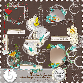
I created this layout for a One Kit Call over at Dido Designs.  I used her new Fresh Love kit.  The preview s of the kit are below.


Really love the simplicity of this layout. Its very fresh.  I am always looking for
just one more embellishment to add to a layout... but sometimes less is more.   You attention is draw right to the middle of the page and the photos.  Everything around the photo enhances it rather than drowns it out.

I think sometimes when you create for a designer you are more aware of pushing the elements. And trying to make them look dramatic, versatile, etc.  But the picture can sometimes get lost in there.  I love this kit because every single element Dido included can stand alone.  They are all so beautiful.


New Release from Creative Victorian Designs


Morning Fresh was released on March 25th. Its a beautiful kit with lovely colors. You can find it at Creative Victorian Designs.com.


I made this layout with it.  I am not a blue fan.  But this periwinkle blue is very hard to resist.  I think its just lovely.

This is my daughter Avery is the bath when she was 2. Oh my gosh she still loves the water.  Showers can go 30-40 minutes.  LOL

Wednesday, March 23, 2011

Tummy ache anyone?

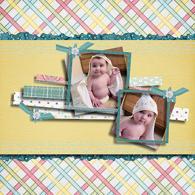
This is Princess Sasha. For most of Avery's life we have called her Princess Sasha and it is because of this photo. When Avery was a baby my mom sent her the most wonderful clothing. And as a mother of a newborn I had the perogative of dressing her in anything I wanted. (Now that she is 7 its a no go.) Edward thought she looked like a Russian princess and dubbed her "Princess Sasha". It stuck.

These photos are some of my favorites of Avery.  I took them so my mom could see how cute she looked in the ensemble. And though I love them, I have never scrapped them.  So during a challenge at Polkadot Plum, I decided to do just that. 


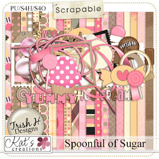
The challenge was to scrap with lots of "white space". Now white space does not necessarily mean "white" it just means to scrap with lots of the background paper showing.  This layout is called "I Could Eat You Up". I think she is cute enough to give anyone a tummy ache. I used Spoonful of Sugar by Kat's Creations. It is sold exclusively at Scrapable


Oh how exciting. I have to add that this layout was highlights in the Polkdot Plum Blog for outstanding layouts posted for their monthly challenges. That makes me happy.

Monday, March 21, 2011

Tuesday Tidbit with Stephanie

Every week I will be writing a " TuesdayTidbit" over at Kat's Creations Blog.  This Tuesday will be a post about the "dreaded drop shadow".   Come on over and take a peek. It's gonna be yummy!

Sunday, March 20, 2011

In these insane moment....

I got a new kit yesterday called Insane Moments.  Isn't that just perfect for my life.  I have been scrapping with it today doing a couple challenges over at Polkadot Plum.  They have some  pretty fun little challenges over there and like many sites you can earn points to their store.  So I went to town.


My first layout was for a challenge about what Home is to me.  I scrapped our home on the bayou in MS.  We plan on moving when the market gets better but i know the kids will have great memories of this 6 acres place so i wanted to preserve it.  I loved the papers in the kit so I wanted to use as many as possible without overwhelming the page.  I actually used one of the frames in the kit to make swatches.  I like how it turned out.


This second LO was for a photography challenge.  The challenge was to get some close ups. LOL Yopu can see that my son would not cooperate.  But I got my revenge. I scrapped his bratty behavior. hehe  I used primarily the Insane Moments kit by Kat's Creations.  There are also some Camera Doodles that were created by Miss Tiina over at Sugar Hill.

Here is Kat's Insane Moments Kit.  You can see more of her kits at Scrapables and Polkadot Plum.


Saturday, March 19, 2011

Win the Artist Studio DVD 5!!!! Learn how - it´s easy!!!

From Digidesign Resort...

Today you have the chance to WIN!!!!

You can WIN our newest NOT yet available

Artist Studio DVD 5!

I can promise you that you'll LOVE this DVD!

Click image for larger version


Name: FinalPreview-DVD5.jpg

Views: 2

Size: 76.2 KB

ID: 4618

So how do you win???

I know I say it about each of our DVDs but this will be one of the BEST - it´s FULL of fantastic nowhere available products, it´s created with LOTS of love and carefully put together.

But we want YOU to design this DVD together with us!

In the last 4 DVDs we covered so many themes in the tutorials with things we thought would be good to know as a scrapper but we are sure there are MANY more themes to cover and tutorials to make - so to win you need to suggest one tutorial.

You can link to a layout you would love to know how to create, a technique you find interesting, a style you find appealing - ANYTHING is welcome!

You can enter 10 or 100 suggestions and you have 10 (or 100) chances to win - just each suggestion needs to be in a seperate post.

The best is - the more suggestions we get the more chances you have to WIN - so come on, suggest tutorials!

50 suggestions = 1 DVD to win

100 suggestions = 2 DVDs to win

200 suggestions = 3 DVDs to win

This contest will run until March 27th, the winner(s) will be announced on March 28th in our forum and choosen by Mr. Random from random.org

Please go here:

Leave your ideas and win!!!

Thursday, March 17, 2011

Irish for a Day!


My kid's were all so concerned that they would not have green to wear today for St. patrick's Day.  *sigh*
I am Italian and proud of it. My husband however, is Scotch Irish and since we have been married my ethnic heritage has gotten the short end of the stick. Maybe because I am not living at home in Boston but down where the potatoes grow. 

Anyway, the kid's all got their green on today and hubby left speaking his fake Irish brogue.  I wore all navy blue today.  Not in protest but because I didn't care. LOL My 5 year old pinched me. :(


Over at Digiridoo Scraps they are having a great scavenger hunt that gets you a cute St. Patrick's Day kit. You basically run around the forums looking for a leprecuan's posting. You then find his pots of gold with letters attached. When you get all the letters and spell the word they make up you get a free collaction of mini kits that coordinate,  a template, alpha and word art. Quite a deal.

So when my 5 year old came home from school sporting a tatoo on his face for St. Patrick's Day I had the perfect kit top scrap his photo with.  Go on over to Digiridoo Scraps and find yourself a treasure at the end of the rainbow.


Help Japan and Learn to Digi Scrap Too!

This is a one day only special! Today!  But the deal over at Digidesign Resort is wunderba! Thats "wonderful" in German.  I just ordered this DVD. Yes its a DVD so it comes inthe mail. 


50% off the income of this DVD go to a charity project
(the other 50% are used for shipping and material)
 
*Note all digital scrapbook supplies are virtual, meaning you buy them and then download them to your computer.  There are not any hard copies of what you are buying until you make the layout and print it.

 The content of this DVD is incredible. 

  • The Artist Studio DVD contains all the tools you need to create sensational projects and keepsakes for celebrations, children, special occasions, holidays and family & friends.
  • Digital Scrapbooking helps you to capture the best moments of your life, preserve your memories easily and share them with your family and friends.
  • The DVD includes easy step by step videos to show you how to get started and how to create different effects in your photo editing program.
  • The Artist Studio DVD also includes 100s of unique elements and backgrounds to create perfect scrapbooks for both beginners and experienced scrapbookers.
  • Bonus videos added! Learn how to create a calendar, photobook and greeting card!

Videotutorials:
  1. Create a basic layout
  2. Create a layout with a template
  3. Adding Shadows
  4. Adding Dimension
  5. Frame a Photo
  6. Get rid of red Eyes
  7. Make a Puzzle out of your Photos
  8. Add realistic Shadows
  9. Recolor Elements and papers
  10. Restore old Photos
  11. Cut out text out of Photos
  12. Turn photos into black/white

These are very basic  digital scrapbooking techniques. They will take you a very long way in creating layouts.
But this DVD just gets better and better because you actually get 5 meage kits with the DVD! Now a Mega kit is just that, MEGA. So getting 5 is like WOW!

Here they are!

Collaboration MEGAKits:
  1. A new Year - Life 365


  2. One day in your Life


  3. Daydreaming


  4. Summer Cottage


  5. Sand in my Toes

I am telling you this, not because I am being reinbursed in any way by the Resort. I am not!  I just think its an awesome deal and one I could not pass up.  What am I getting?

  1. A DVD with video tutorials
  2. 5 Megae Kits
  3. Bonus materials
  4. Make a donation to the disaster in Japan!
Just more than I could pass up and I have been offered this deal in other forms from the resort since I joined their newsletter mailing list.

Ok enough of my ranting. LOL Go get familiar with the resort. You will not regret it.  Its a wonderful community with some wonderful people.

The End.  (Now I am really done!)

Wednesday, March 16, 2011

White Balance!

No, this is not about causasians getting some psychological equilibrium though I would argue some people might need more than their share...   I am talking about the kind of white balance that makes your digital photos shine just that much brighter.

When I was younger... way younger, I use to write cable commercials. My stepfather had a video production company.  He was a professor at the local college. He taught communications which included video and audio classes.  When I graduated college, he had gotten a contract to do local cable commercials.  We did them for $400 bucks a pop.  How did we do it for this little.  Because, I was a one man band, um one woman band.  I shot the video. I wrote the voice over. I edited the commercial together and choice the music.

To get to the point, one of the things I learned about shooting video is to set the white balance on the video camera.  You had to tell the camera what white was so that it could figure adjust for all the other colors. If the camera knows white then it is more likely to give you a true red or a true blue.

I do not explain these things with the eloquence of some. So I am inserting an explanation from a white balance tutorial from CambridginColour.com

White balance (WB) is the process of removing unrealistic color casts, so that objects which appear white in person are rendered white in your photo. Proper camera white balance has to take into account the "color temperature" of a light source, which refers to the relative warmth or coolness of white light. Our eyes are very good at judging what is white under different light sources, but digital cameras often have great difficulty with auto white balance (AWB) — and can create unsightly blue, orange, or even green color casts. Understanding digital white balance can help you avoid these color casts, thereby improving your photos under a wider range of lighting conditions.

 The funny thing is that I forgot all about white balance in the years since I did cable commercials.  I knew the concept but forgot the practice.  I recieved an email newsletter from Polka Dot Plum today with a tutorial about using white balance with digital camera.  You can read the whole article in the link above.

There is a challenge in there to create a before and after picture using white balance between shots.  Brenda even included a cute template to display your before and after but to get them free you have to get Polka Dot Plum's newsletter.  And if you want to know the truth of it... there is a full kit that comes through with that newsletter too. Its the cutest thing. So far I have the paper and the elements.  So go over there and sign up for their newsletter for some great treats.


At first glance this might look like the same photo but it is NOT. Take a closer look. You can see that the second is brighter. The white of the railings is crisper and less gray.  Doing the exercise made me realize that my photos can be all that much better with one more click of the camera.

Getting white balance is not that hard.  You will need to find your User manual. LOL  But I found mine pretty fast.  The white balance on my camera can only be set using the manual setting.  I tried an experiment first and did the same white balance procedure on automatic and the results were disappointing or not.  The camera sets its own white balance. Of cours,e it can not do that unless there is white in the picture so its not very reliable.  When I told it what white was with a piece of white paper and a click of the shutter, it still output the same photo when I retook a picture of the magnolia tree.  Nice pictures but the camera did not register that it had any new information between shots.

Setting a white balance on your camera requires that you give the camera some thing white.  I took a piece of paper and held it up in front of the camera and took a picture. Again, this was on manual.  The next picture I took gave me a better image. Thus my "before and after".

Just going through this little exercise made me realize how important white balancing is to a good photo.  Much less time playing with it in PSP that's for sure.  Try it yourself and see!  Happy white balancing!

Tuesday, March 15, 2011

Playing with another kit!

This one is called Primavera.  CocoDigiscrapteuse created this exclusively for 123 DigiScrap. It is a French site... so the challenge is on! haha. But, oh its beautiful!


I made this page using a picture of my cute little niece, Laura Grace.  She is swinging on a barn gate in her mud boots.

Here is the preview of the kit! You can see both the elements and papers!


I hope you like what i have done with it! I think my sister-in-law will be delighted with this page.

Monday, March 14, 2011

Viva La Vita Release March 19th!

But, nevertheless, the kits are just gorgeous.  Here is the preview for Viva la Vita that is due for release on March 19th.


So without further adieu (oh look, a French word!) I want to show you my first layout with her kit, Viva La Vita!  This is my best friend Vikki's daughter, Emily at her baptism.  I am quite proud of this photo. i took it myself.


You can find CocoDigiscrapeuse kits at the following Digital Scrapbooking Boutiques:


You can find Coco's blog here.

And remember, if you can't read or translate French go to Google Translate and they will do it for you. If you have Google Chrome Browser, Chrome does it for you automatically.


Sunday, March 13, 2011

Luxuriate


Luxuriate - Massage
I have a wonderful husband!  He is created so many amazing memories for me that represent his love.  Once, before we were married, he delivered roses to my place of work dressed as a florist delivery person.  And when he proposed to me, he sent me on a scavanger hunt that sent me place to place where he has left poetic clues to his where abouts. I found him at the table in the cafe where we had our first date.   Not to make you all jealous.

Luxuriate - Beau Rivage

For my last birthday, I woke on Friday morning to breakfast in bed. Blueberry pancakes with fresh strawberries and whip cream on top. He also made me a frozen latte!  And he took the day off to take care of the kids while I went ot the Beau Rivage Resort for a chocolate butter massage!  I told him he had me at "I took the day off" but the massage was fabulous anyway.  We then went to the buffet at the Beau which we never go to because its so expensive.  What a wonderful day.  He made me feel special once again.

The layout above is one of the two I did to commemorate such a wonderful day.  It is images of the things around me during the massage.  The second layout is of our lunch at the buffet and the lobby of the hotel.


I used the wonderful kit called Autumn Delight created by Schnuki.  Oh gosh this kit is wonderful.  There are such magical elements in this kit.  The paper alone has some really wonderfuly unique attributes.  One ones I used are like canvas with frames. So the idea of creating a setting on the paper that reflected the feeling of the day I spent at Beau Rivage made perfect sense to me.


You can see how many elements alone you get with this kit.  Some are magical. Some are traditionally fall while others are fun and quirky.  I have used this kit a number of times since I made these layout in mid February.  I kept thinking, you can't use a Fall kit to make these layouts but the theme didn't limit me at all.


My First CT!

I am so so excited! And a bit frazzled to be honest.  I have been applying for a position on a few designer's Creative Teams (CT).  I may have mentioned that being a member of a CT means you get to promote that designer's new kits by scrapping with them and posting them on galleries and blogs for all to see.  This is a way that designers can get their kits out in the scrap community. Everyone who looks at that layout will see what can be done with their kit.

Today I was appointed to CocoDigiscrapeuse's CT!  Yay Me!  I am really jazzed.  The reason i am frazzled is that Corinne, the designer is French.  I feel like I have entered into a very exotic world. I have been trying to familiarize myself with her forum and my responsibilities but everything has to be translated for me. LOL


Saturday, March 12, 2011

I love a Good Collaboration Kit

I just completed this cute layout of my daughter Avery.  I love these photos of her as a baby.  At 7 years olf she is becominbg too old for me to scrap the sweet colors of babies.  So when I need a fix, I just got back and grab baby photos and go to town.


I used a collaboration kit from Digiridoo Scraqs.  Its called Thula Baba.  Just a $5.00 purchase at their shop gets you this kit free.  And let me tell you, its loaded.  

72 papers
90 Elements
23 Word Arts
6 Alphas
2 Templates

And because its a collaboration kit... you get papers and elements from a number of their designers.  The papers themselves are very versatile.  And the elements are just real fun.  I have actually used this kit for a number of layouts since I got it this last week.  I can not stand how cute it is.  This would be great for a baby book.  The colors and elements would take you such a long way.

Many site offer collaboration kits each month from their designers. Sometimes you can earn them by participating in challenges.  Sometimes it just takes a purchase amount at their store.  But either way, collaboration kits are usually HUGE with alot of diversity in elements and style.  So they are a great way to stretch your digi scrapping buck.

Wednesday, March 9, 2011

Fee Jardine Guest Creative Team Challenge

This is a layout I did for a challenge.  Fee Jardine has a challenge on her blog each month for a chance to be a guess member of her creative team.  Being a part of a CT means that you get to create layouts for the dedigner in order to highlight their new kits.  I have never done this but would love to try.  You might have remembered that I made a layout last month but didn't submit it.  But I am not going to make the same mistake again.

Not sure why but when I resized it I had some trouble getting good quality.  Still trying to make sense of it in Paint Shop Pro.  If you click on the layout it will take you to a larger version which is not very crisp.

Well here it is. 

Something of Yourself

The challenge was to create a layout and incorporate a quote from Mr. Rogers to commemorate his birthday which is this month.  The quote I used reminded me of the full potential young children have to change the world.

"If you could only sense how important you are to the lives of those you meet; how important you can be to the people you may never even dream of. There is something of yourself that you leave at every meeting with another person."

And since I love to scrap my kids baby pictures I went back and got one of my two sons.  Oh the potential!
I used Fee Kardine's What's Happening Kit.  Fee is a designer over at The Sweet Shoppe. Seems I am given alot of sugar to the Sweet Shoppe this week.  LOL


Wish me luck on this one!

Using Templates

For Edward
I just completed this layout. LOL  It was suppose to be for Valentine's Day and was for my husband.  I have a folder for "Works in Progress" and it kinda got stuck in there.

Don't get too excited. The layout itself is not mine.  I worked off the template below. I am NOT the brilliant.  Isn't this template amazing. This template is designed by Cindy Schneider at Sweet Shoppe Designs.  She has some really extraordinary templates over there. If you want to try Digital scrapbooking but need help with layouts, templates are a great way to go.  I am addicted to them myself. :D

Cindy Schneider's XOXO Template
I started doing  this layout with traditional reds for Valentine's Day but I decided I really wanted it to look non traditional.  So I used the Doctor Doctor kit by Cindy Schneider and Pink Reptile Designs.m Yup, you got it! The same designer who did the template.

Doctor Doctor

I love the Doctor Doctor kit. It was perfect for what I was looking for in a kit since my husband is a doctor and these colors remind me of him. They are both masculine and unique.  Just Like him.  I think it turned out great, even if it s a tad late.

Go check out all Cindy's templates over at Sweet Shoppe.  You will be inspired.

Tuesday, March 8, 2011

DigiridooScraps Quality Control Team Member

I am so excited to announce that I have been given a chance to be on the Quality Control Team at DigiridooScraps.

I, along with other team members will be checking to make sure each piece of each kit meets a standard set
by the Digiridoo Management team and Designers. 

After a kit goes through the checking it will be stamped with a Quality Control stamp so that consumer know it has gone through a process of checking.

Things that are checked for include stray pixels or jagged edges of elements, ghosting or shadows on elements, blurriness, consistency of element size, file size of papers, seamlessness of pattern paper just to name a few. 

Its a fun process for those who love to pay attention to detail.  And I get to see the new and exciting stuff coming out of in the store before a lot of other people. LOL

Saturday, March 5, 2011

All About ME


I created this layout for a Theme Challenge over at  Digidesignresort.  They have some fun challenge that earn you a HUGE collaboration kit each month.  Well worth the time.  The theme last month was "What gets you up in the morning?"  This month it is do a layout that expresses who you are.  I originally did this for a challenge on Fee Jardine's Blog to get a guess spot on her Creative Team but I did not turn it in. I am always so hard on myself and thought it was too cuties.  But i have since gotten alot of good feedback on it.  And it does tell a lot of about who I am.

I made the Layout with Jenn Barrette's I Love You Sew Kit and Fee Jardine's Tweetie Kit.  Both these designers can be found at the Sweet Shoppe.  I also included elements from Vera Lim's happy Collection.  Love, love, love Vera Lim!


I Love You Sew by Jenn Barrette

Tweetie by Fee Jardine


Happy by Vera Lim