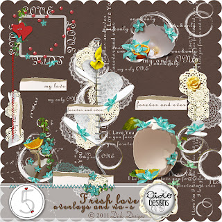
I created this layout for a One Kit Call over at Dido Designs. I used her new Fresh Love kit. The preview s of the kit are below.
Really love the simplicity of this layout. Its very fresh. I am always looking for
just one more embellishment to add to a layout... but sometimes less is more. You attention is draw right to the middle of the page and the photos. Everything around the photo enhances it rather than drowns it out.
I think sometimes when you create for a designer you are more aware of pushing the elements. And trying to make them look dramatic, versatile, etc. But the picture can sometimes get lost in there. I love this kit because every single element Dido included can stand alone. They are all so beautiful.


No comments:
Post a Comment